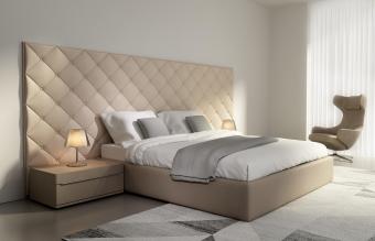
The selection of colors for a well-appointed décor is easy when you follow one of the interior design rules. These time-tested guides will help you find the best coordinating colors to use in your home décor.
60-30-10 Rule
Perhaps the oldest interior design rule, the 60-30-10 divides a color scheme into percentages of color use.
60% Main Color
The main color should represent 60% of color used in your room design. This typically includes the wall color, floor color (either carpeting or an area rug), and a furniture piece or two. It may also include the window treatment, such as curtains or draperies. All of these don't necessarily need to be solid colors, but the main color should always be prominent.
30% Secondary Color
The secondary color will represent 30% of your décor color scheme. With only half the amount of color saturation as the main color, the secondary color doesn't compete for attention in your overall design. Instead, it should contrast with the main color. Being a different color, the secondary color creates depth and interest in your décor.
10% Accent Color
The next color will be one-third of the secondary color and one-sixth of the main color. This color is designated as the accent color. Its purpose is to give greater interest and contrast to your color scheme. It should be used throughout the décor to draw the eye deeper into the room design.
Example of 60-30-10
An example color scheme using the 60-30-10 rule includes:

With love of photography Getty Images Gray and pink bedroom interior design
- 60% Gray main color
- 30% Light blue secondary color
- 10% Pink accent color
Color Wheel
The color wheel is a great guide to help match colors for interior design. This color circle presents the primary, secondary and tertiary (colors between primary and secondary colors) colors. There are two ways to use the color wheel for selecting a color scheme.

Analogous Color
You can select analogous colors from the color wheel for a color scheme. These groupings are divided into threes. They typically consist of the primary, secondary and tertiary colors, but can be any three colors that are located side by side on the color wheel. Apply the 60-30-10 rule for a balanced color selection.
Examples include:
- Green (60%), yellow-green (30%) and yellow (10%)
- Yellow-orange (60%), orange (30%) and red-orange (10%)
- Blue-green (60%), blue (30%) and blue-purple (10%)
- Purple (60%), red-purple (30%) and red (10%)
Complementary Colors
Another way to use the color wheel is by selecting complementary colors. These are the two colors that are directly opposite each other on the wheel. For example:
- Yellow and purple: If you select these colors, add white or brown for an accent color.
- Orange and blue: When using these colors, select black or white for an accent color.
- Red and green: With these tones, opt for gold or silver for an accent color.
Rule of Three
The rule of three is similar to the three-color selections made in the analogous color use of the color wheel, only you don't have to use the color wheel to determine the three colors you use.

Odd Numbers in Design
The rule of three states that using odd numbers in design results in an interesting and balance décor. It's all about using odd numbers, which don't stop with three and can address any odd numbers to be used in design. However, three seems to be the optimal number when applying the rule to interior design.
Working with Three Colors
When following the rule of three, you will select three colors to use within your color scheme. You may want to refer to the 60-30-10, analogous colors, or even complementary colors with an accent color choice added. The choice is yours, as any such combination can work when you are applying the rule of three.
Keep the Color Scheme Flowing
Once you've selected a color scheme for the main room in your home, choose one color from it to carry it throughout your home. You can always add other colors to the main color when moving from one room to the next. This strategy will keep your home décor flowing and cohesive without being too similar in every room.


